ggplot2 and plotly are very advanced charting libraries but sometimes it may be preferable to use base graphics, e.g. if one needs to fine-tune the chart layout.
A [not so] well-known R package DescTools draws nice ohlc plots and allows parsing arguments to plot() command.
Recently I had a challenge to scrutinize the sensitivity and lags of two indicators (that are roughly "buy the dip" and "trend is your friend; till it bends")
For some reasons I prefer to keep original scale of stock and indicators chart, so I plot them in two subplots. However, I need a precise layout for arranging these two subplots in order to see the extrema and possibly lags of indicators.
A precise layout means not only a proper alignment of X-axis but also an eye-helping grid (lightgrey vertical lines in both subplots that conformly merge in one grid).
Although there are many options to arrange several ggplots on a single canvas, I did not get a quick idea how I can meet all my needs with a ggplot.
Fortunately, DescTools::CandleStick offers a nice option.
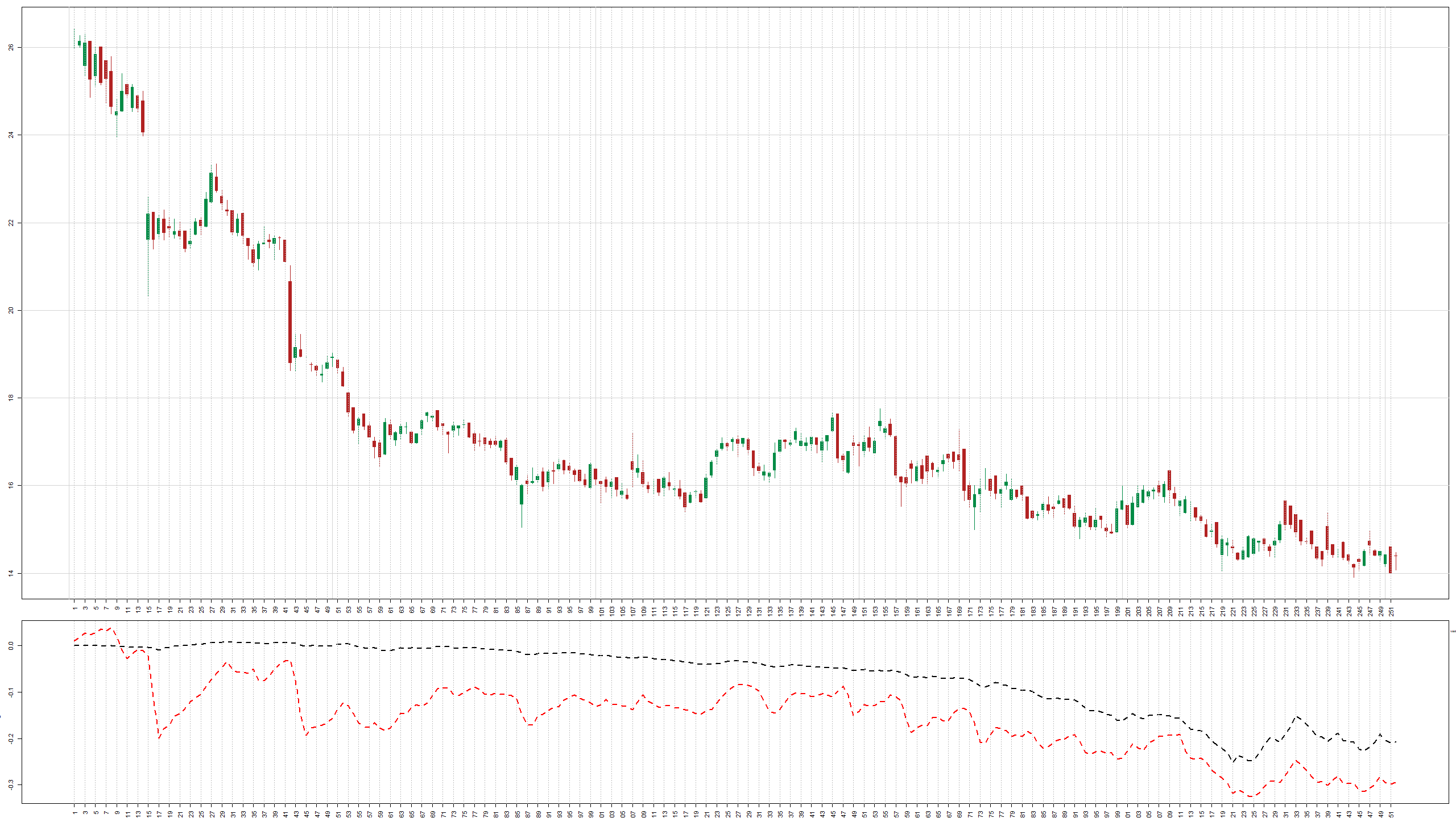
To create this combined plot we first need to declare a proper layout.
#3/4 of canvas for the main chart(1,1) and 1/4 for the indicators(2,2)

layout(rbind(c(1,1), c(1,1),c(1,1), c(1,1), c(2,2)))
#(bottom, left, up, right) margins
par(mar=c(2.0, 3.0, 1.0, 1.0))
#layout.show(4) #uncomment to see the layout sketch
Further we get the ohlc data from Yahoo.Finance (convert them into a matrix with 4 columns since DescTools::PlotCandlestick does not understand the .xts objects).
Note that argument xaxt="n", (i.e. do not plot the X-axis yet) which is passed to R plot command.
Next command axis(1, at = seq(1, 252, by = 2), las=2) (which plots axis with labels in a nicely form) is also passed to R basic graphics.
nor = quantmod::getSymbols("NOEJ.DE", auto.assign = F)

DescTools::PlotCandlestick(1:252, as.matrix(tail(nor[,1:4], 252)), xaxt="n")

axis(1, at = seq(1, 252, by = 2), las=2)

abline(v=seq(1, 252, by = 2), col="grey", lty="dotted")
And finally plot axis and grid in indicator subplot
plot(buyTheDipIndicator, lty="dashed", lwd=2, type="l", xaxt="n")

axis(1, at = seq(1, 252, by = 2), las=2)

abline(v=seq(1, 252, by = 2), col="grey", lty="dotted")

lines(trendIndicator, lty="dashed", col="red", lwd=2)
FinViz - an advanced stock screener (both for technical and fundamental traders)